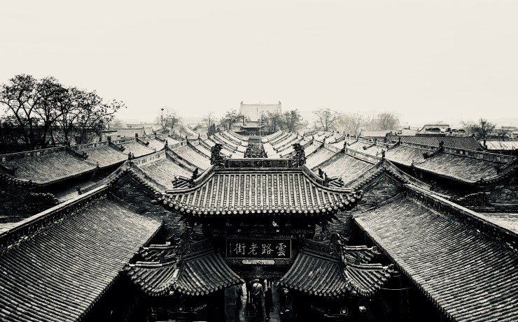
In this blog, I first create a start page inspired by Michael Kenna’s blog. This page is used to give audiences an initial impression of the theme of this blog and my photography style. Also, the action of click the title box to enter the home page can increase the interaction feeling.
As for background color, I choose grey like Andrea Corsi did. One reason is grey as the intermediate color of black and white can make the page look softer and more relax. Another reason is this color is cold and correspond to my topic, black and white traditional style.
In the layout of the home page, I refer to Daniele Vertelli’s design. That’s because the way that each picture corresponds to a story is fix to my theme that travel with photography. And the diary format with date and personal experience will give the viewer a sense of substitution.
When select the fonts, Tangerine be used in title because it represents classical and elegant style. On the other hand, I choose Noto Sans which is like Andrea Corsi’s for basic font is to create a comfortable and tiny atmosphere.
To make this blog more personal, I use the main picture to create a site icon.
